
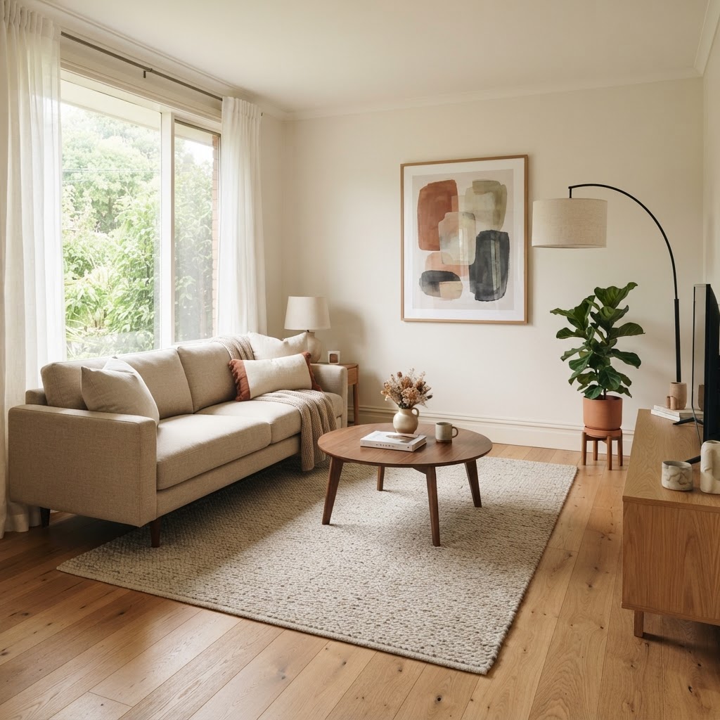
A successful Scandinavian-minimalist living room with a warm, cohesive palette of beige, sand, and wood brown, based on a neutral #d8d2c5 base. The space is airy and well-lit thanks to a large window, but the palette is almost monochromatic and low in contrast (most measured ratios fail AA), and the focal point — the framed picture — is strong but competes a bit with the ficus plant and the rainbow lamp next to it. The layers of artificial lighting are present but weaken against the strong natural light, and part of the space on the right is a bit dark.
Color harmony
The palette is built almost entirely on matching warm-neutral tones: background #d8d2c5, sand tones #bbac95 and #c5b8a5, and deep wood browns #6a4b2f and #856446 — all speaking to each other in pleasant analog harmony. The problem is very low contrast: #c5b8a5 on #d8d2c5 gives only 1.29:1 and #cfc6b6 on the background only 1.12:1, which flattens the space and loses depth. The terracotta accents in the pillows and vase and the gray-blue tones in the image are the only colorful salvation.
Add 2-3 touches of a more saturated color in a terracotta or deep blue-gray shade (as in the photo) — for example, an extra blanket or pillow — to break up the monochrome and increase local contrast above 3:1.
Spatial flow
The main path of movement between the sofa and the round coffee table is open and allows for passage, but the distance between the edge of the sofa (~x:28%) and the coffee table (~x:32%) is relatively close, which reduces the frontal 'breathing' area. On the right side of the frame, the plant, television, and sideboard form a dense cluster that blocks the continuation of the visual reading along the wall. The woven beige rug (~x:5%, y:62%) anchors well and clearly defines the seating area, and the large glass window (~x:0%, y:0%) contributes significantly to the feeling of openness.
Moving the sideboard/TV stand a few dozen pixels to the right (or anchoring it to the wall completely) will open up space between the plant and the furniture and relieve the crowding in the right corner. Additionally, moving the coffee table slightly away from the sofa will create a more comfortable transition.
Proportionality of furniture to space
The three-seater sofa (~x:0%, y:35%) sits in good proportion to the visible space — not too big and not too small, with a standard-looking seat height and light wooden legs. The round coffee table (~x:32%, y:55%) is low and aesthetic, but looks small-medium in relation to the sofa, creating a slight visual imbalance. The sideboard (~x:75%, y:60%) is cut off at the front of the frame and it is difficult to appreciate its full width, but its height is low and fits the style.
A larger diameter (or oval) coffee table will better balance the visual weight of the sofa. If you want to keep the table round, add a matching ottoman or stool next to the sofa to balance the scale.
lighting
Strong, warm natural light enters from the large window on the left and illuminates most of the space, creating an overall pleasant temperature. There are layers of artificial lighting — a bedside lamp, a rainbow lamp, and a floor lamp — but in daylight they are mainly decorative and do not contribute to actual mood lighting. The lower right side around the sideboard is a bit dark, and the light curtain #f0f0e6 softens the glare nicely.
When lighting in the evening — adjust the rainbow lamp and dresser to a warm hue (2700K) to create a layer of ambiance; consider a warm strip of lighting behind the TV/sideboard to eliminate the dark area on the right.
Stylistic consistency
השפה הסגנונית הסקנדינבית-אורגנית עקבית ברובה: עץ אלון בהיר בפרקט (#856446, #6a4b2f), שולחן קפה מאגוז כהה, מזנון מעץ בהיר — שלושה גוני עץ שיוצרים עומק מבלי לשבור את הפלטה. הכרית הטרקוטה הבהירה על הספה, והאגרטל עם פרחים יבשים מוסיפים נגיעות חמות עקביות. הגוף האחד שמעט חורג הוא מסגרת הטלוויזיה השחורה-מבריקה (#2e2513 בגוון, אך בפועל שחורה) על רקע כה חם ומט — היא מציגה סיים שונה לחלוטין מיתר הרהיטים.
שקלו להוסיף מסגרת עץ בהיר לטלוויזיה (קיימים פתרונות מדבקה/מסגרת DIY) או להסתיר את הטלוויזיה מאחורי ארון פנל-עץ סגיר, כדי לשמור על רצף חומרי אחיד לאורך כל הקיר הימני.
נקודת מוקד
התמונה המופשטת הממוסגרת מעל הספה היא נקודת מוקד ברורה וממוקמת נכון על הקיר המרכזי, בגובה עיניים ובצבעוניות שבולטת מול הקיר הבהיר. עם זאת, צמח הפיקוס הגבוה והמנורה הקשתית מימין יוצרים אזור עניין מתחרה שמושך את המבט הצידה. שולחן הקפה העגול והאגרטל מתפקדים כמוקד משני נעים במרכז.
כדי לחזק את היררכיית המוקד, הזז מעט את הפיקוס ימינה או הנמך את גובהו כדי שלא יתחרה בקו הראייה אל התמונה, והשאר את הקיר מסביב לתמונה נקי.
מיתוג ומסר אישי של החלל
הפריטים בחלל — התמונה המופשטת (~43%,8%), האגרטל עם הפרחים היבשים (~43%,57%) והספרים על השולחן (~42%,62%) — הם אביזרי סטיילינג גנריים ונפוצים בקטלוגים סקנדינביים, ואינם מספרים סיפור אישי ספציפי על הדיירים. אין תצלומים אישיים, אובייקטים ייחודיים, אוספים או פריטי זיכרון שמייחדים את החלל מכל סלון סקנדינבי אחר. הפלטה הבז'-חומה האחידה (#c5b8a5, #ac9a81) תורמת לאווירה נעימה אך גם לתחושת 'קטלוג' חסרת חתימה אישית.
הוסיפו 1-2 פריטים אישיים ייחודיים — תצלום משפחתי ממוסגר, אובייקט מאספנות, או יצירת אמנות מקורית שאינה מודפסת המונית — כדי ליצור זהות מובחנת לחלל.
התאמה תפקודית
הספה התלת-מושבית (~0%,35%) והשולחן העגול (~32%,55%) יוצרים ישיבה נוחה ובסיסית, אך מזנון הטלוויזיה (~75%,60%) פתוח וחסר דלתות נראות לאחסון, כך שאין פתרון נראה להסתרת פריטים יומיומיים כמו שלטים, כבלים או תיקים. כמו כן, השולחן העגול הקטן (~32%,55%) מוגבל בשטח משטח לשימוש יומיומי מרובה (כוס, ספרים, כלים) לצד ישיבה של יותר מאדם אחד.
הוסיפו שידת אחסון סגורה נוספת או קופסאות/סלי אחסון תחת השולחן לפריטים יומיומיים, ושדרגו את שולחן הקפה למשטח מלבני גדול יותר שמאפשר שימוש נוח למספר אנשים בו-זמנית.
 Translate